How to Make Charts to Visualize Your Data
After you run a query, look for the Chart button to create a chart.
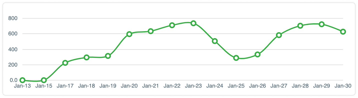
Line chart
Let's look at how many questions are asked per day on StackOverflow:
select *
from `bigquery-public-data.stackoverflow.posts_questions`
where creation_date between '2020-01-01' and '2020-01-31'
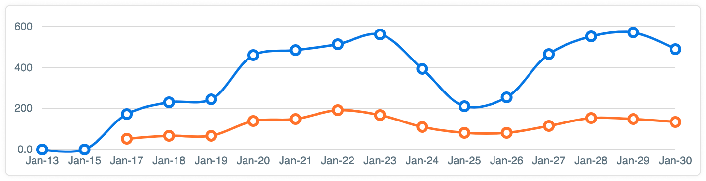
If we wanted to see two series, one for answered questions, and another for unanswered questions, we need an answered boolean column:
select
  *,
  answer_count > 0 as answered
from `bigquery-public-data.stackoverflow.posts_questions`
where creation_date between '2020-01-01' and '2020-01-31'
Here's a video tutorial showing how to create a line chart:
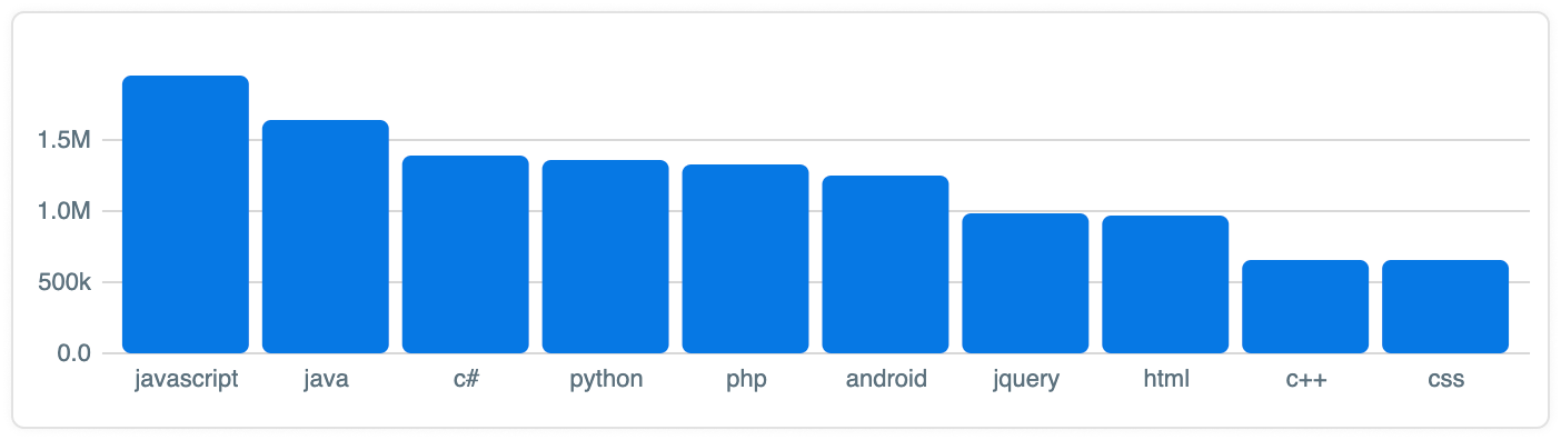
Bar chart
Let's look at the top 10 most popular tags on StackOverflow and make a bar chart.
select *
from `bigquery-public-data.stackoverflow.tags`
order by count desc
limit 10
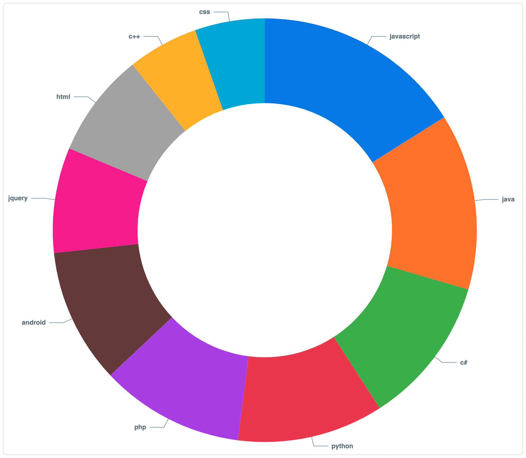
Pie chart
Using the results from the previous pie chart example, here's what it would look like if we changed the chart type to a pie chart:
Combo Chart
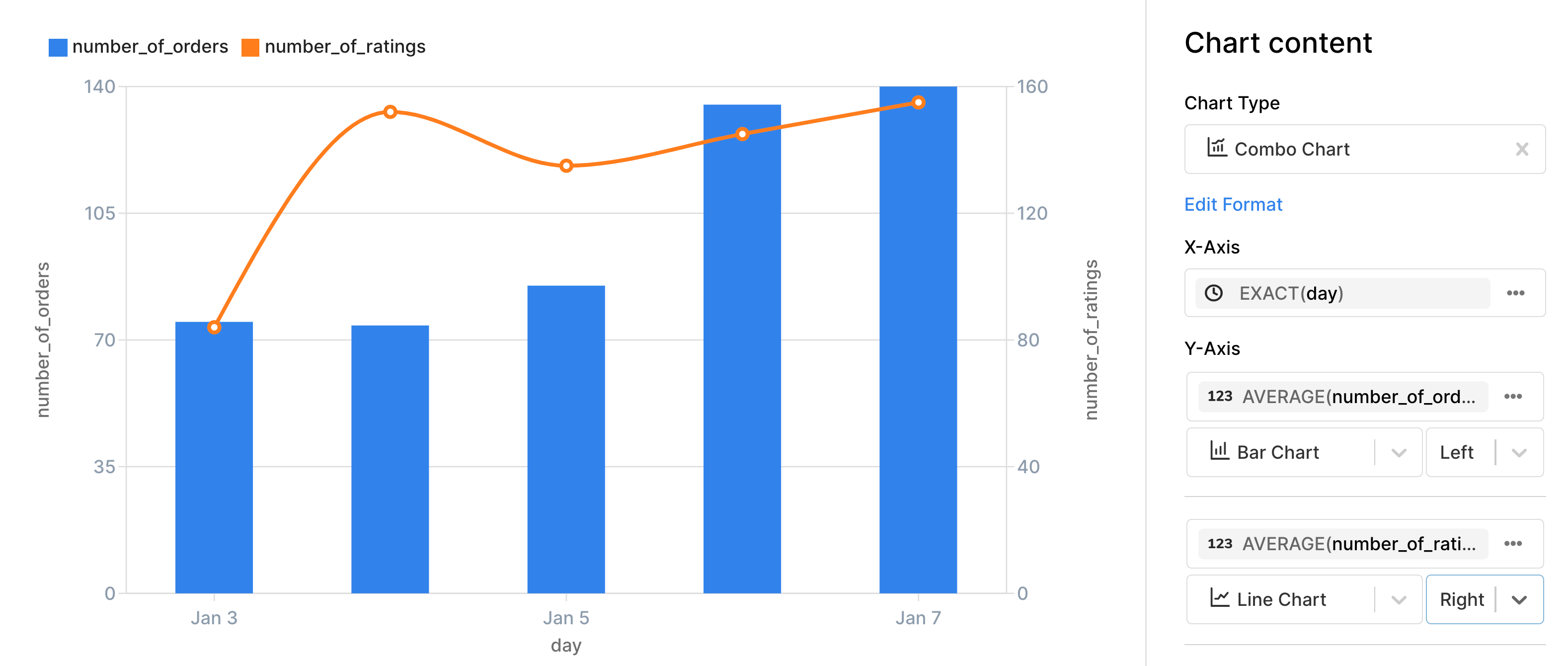
Given a chart with two distinct sets of data with the same x-axis, like the data set below:
| day | orders | ratings |
|---|---|---|
| 2021-01-03 | 75 | 84 |
| 2021-01-04 | 74 | 152 |
| 2021-01-06 | 135 | 145 |
| 2021-01-05 | 85 | 135 |
| 2021-01-07 | 140 | 155 |
You can now create charts that have two y-axes. For example, this chart has a bars representing the number of orders on the left y-axis, and a line representing the number of ratings on the right y-axis.
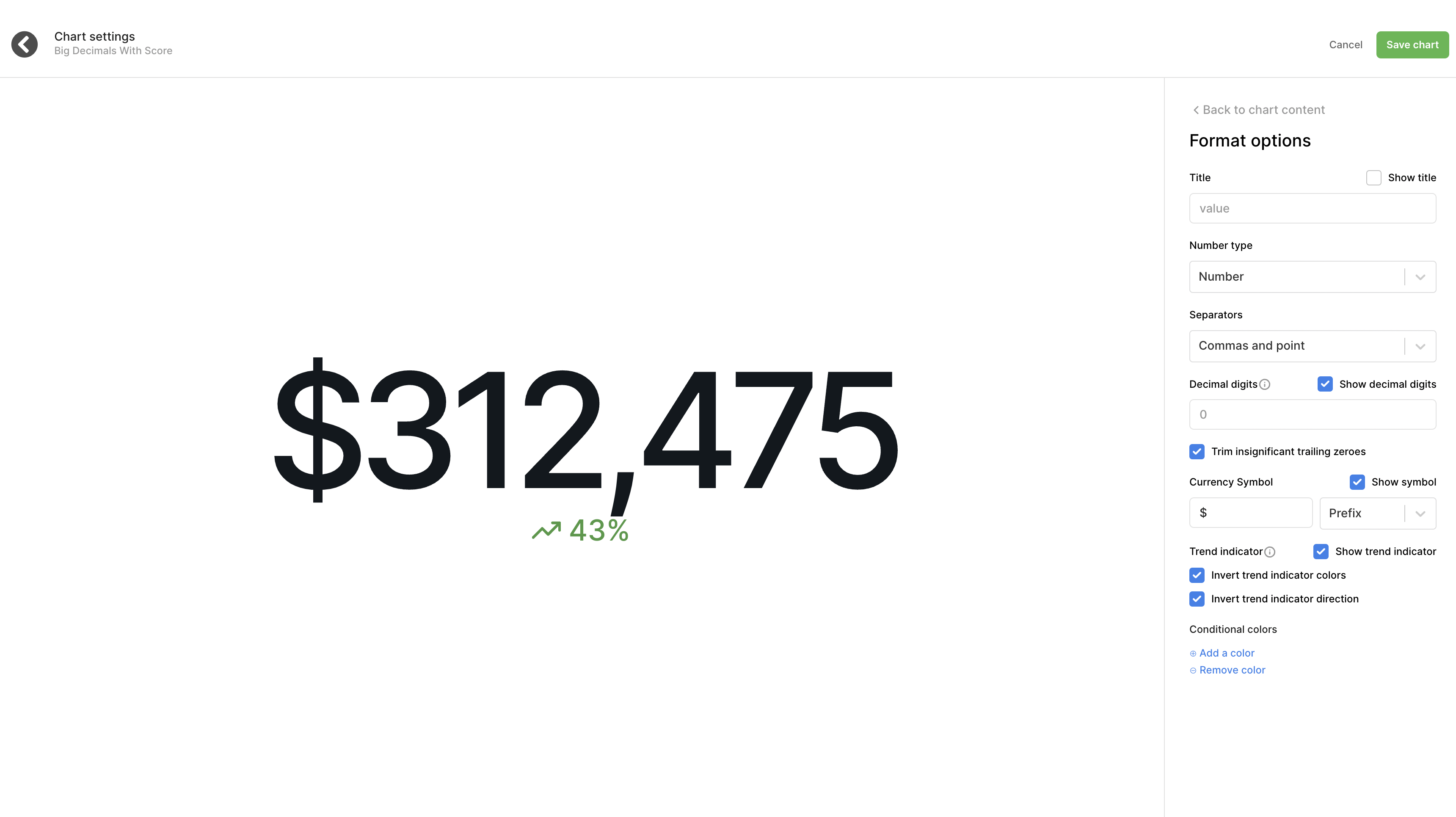
Big Number Chart
If you just want to show a number in your chart, generally to make a dashboard more clear, you can use the big number chart. You can show your number as an average, count, maximum, minimum, or sum of your data.
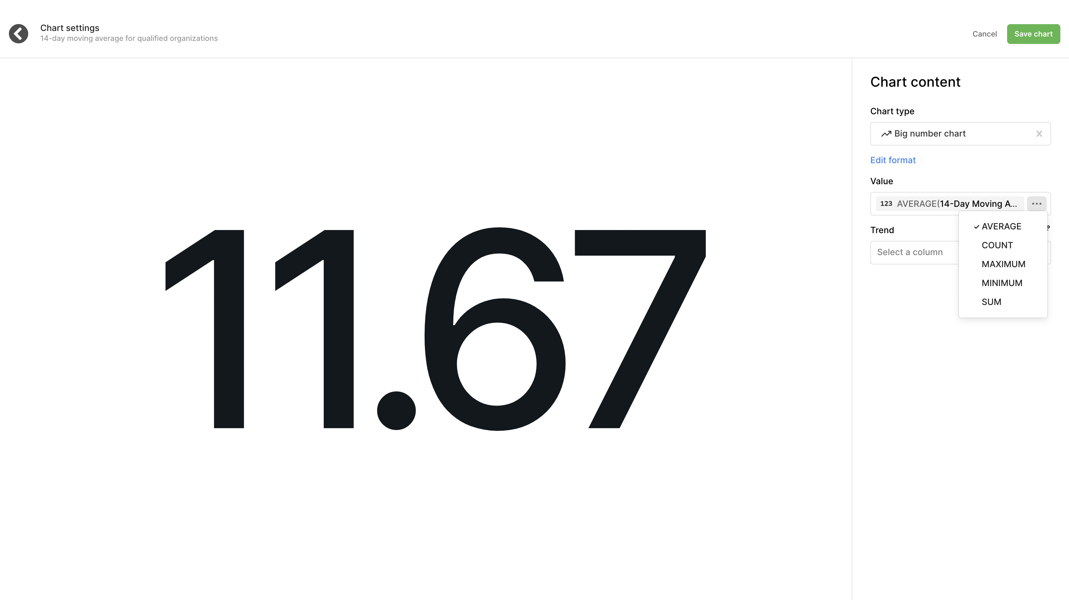
Choose a column in which to trend by (we suggest a date) to see how your data is changing over a given interval.
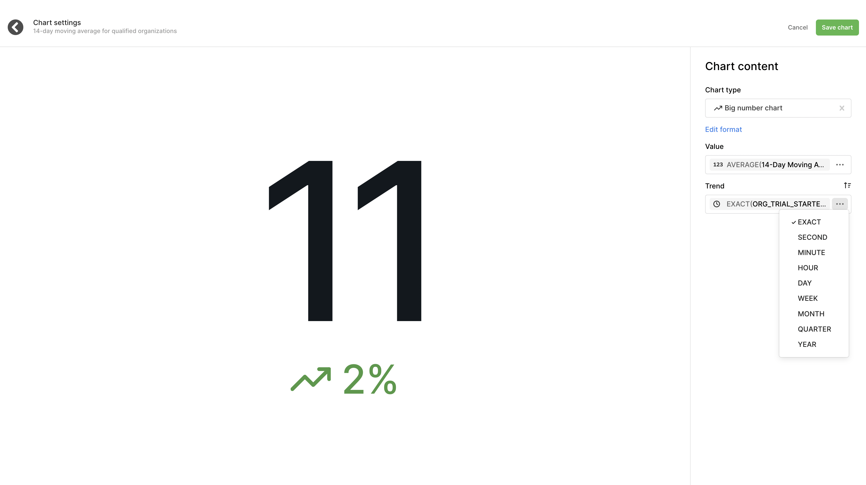
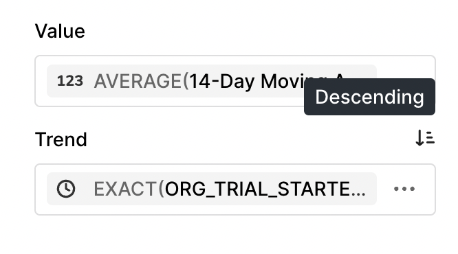
You can also choose unsorted, ascending, or descending to help properly convey the trend you'd like to show.
Clicking on edit format will allow you to get into the weeds for your big number chart. This includes how you display the value (number, raw value, percentage, or rounded), separators, decimals shown, currency symbols, and the ability to change your trend direction and color.
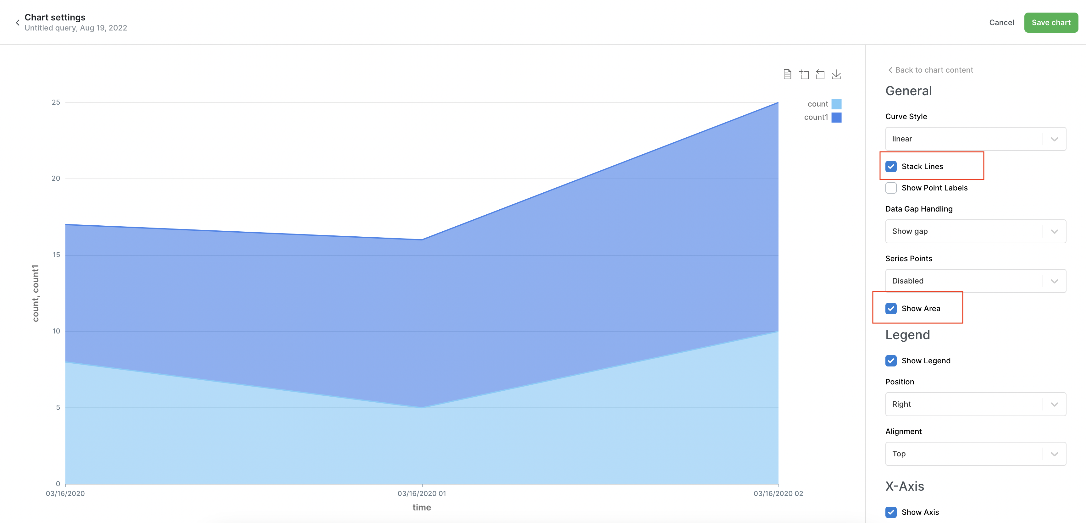
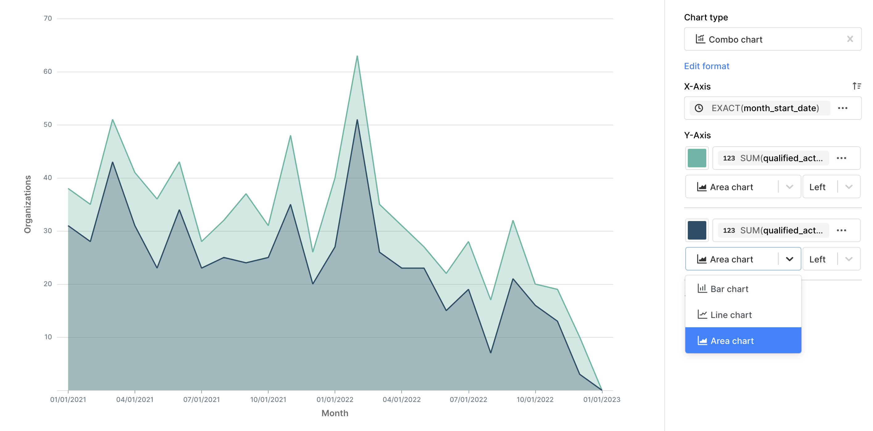
Area Charts
If you want to show a line chart with the area between the lines and axes filled in you can utilize area chart features. You can fill in the area from combo charts or directly from line charts.
To show a line chart with the area filled in click into Edit Format on your line chart and select Stack Lines and Show Area
To show the area on a combo chart click Edit Chart and then in the Chart Content under the Y-Axis options select Area Chart for however many lines you are working with.
Updated over 1 year ago