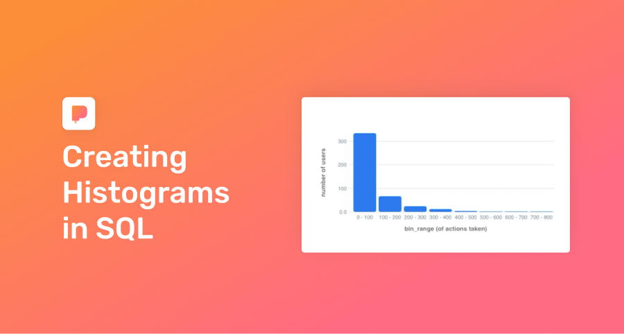
Creating Histograms in SQL
In the past week, ~500 users signed up for your product. Did they poke around, then ghost? Or did they explore your product and stick around?
To find out, you can bucket users by “levels of product activity”, a perfect job for a histogram.
Why histograms?
Histograms bucket your data so it’s easier to visually grasp.
Assume you had a simple table product_actions that recorded actions taken in the past week per user:
| user_id | actions_count |
|---------|---------------|
| 411534 | 630 |
| 411535 | 7 |
| 411536 | 1 |
| 411537 | 239 |
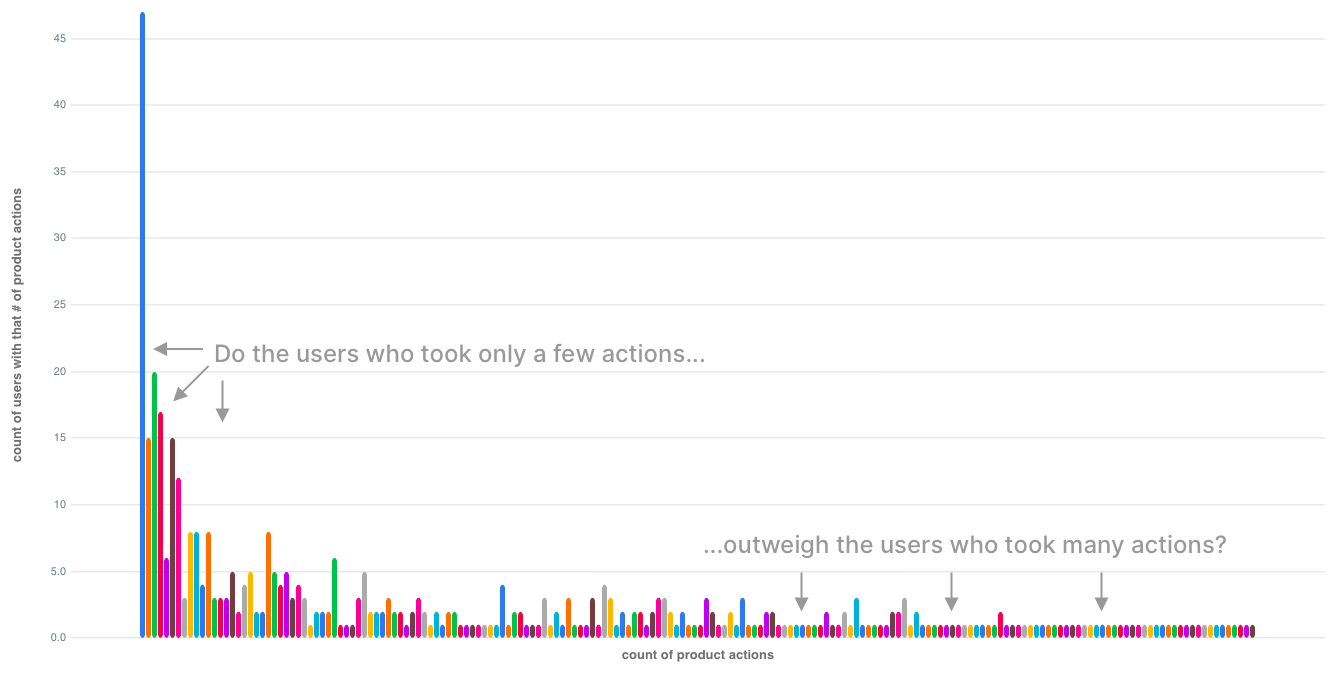
| ... | ... |If you had simply written a query like this:
select
  actions_count,
  count(user_id)
from product_actions
group by 1
order by 1;
you’d get a noisy, hard-to-interpret chart 😞 :
SQL you can copy / paste
While the SQL for histograms looks complex at first, we break it down step by step.
First, group your users into bins of activity using the floor() function:
select
  floor(actions_count/100.00)*100 as bin_floor, -- we explain why 100 in a sec
  count(user_id) as count
from product_actions
group by 1
order by 1;
The floor() function simply rounds a decimal down to the nearest integer (Postgres docs).
To illustrate:
- An
actions_countof 630 divided by 100.00 equals 6.30. - The
floor()function then rounds 6.30 down to 6. - Multiply each result of the
floor()function (e.g. 6, 7) by 100.00 to get thebin_floorfor eachactions_countrecord. - As a result, every
actions_countfrom 600 to 699 will have abin_floorof 600.
| actions_count | / by 100.00 | After floor() | * 100 (aka bin_floor) |
|---------------|-------------|---------------|-----------------------|
|      630      |     6.30    |       6       |          600          |
|      657      |     6.57    |       6       |          600          |
|      727      |     7.27    |       7       |          700          |
Why did we pick 100 as the divisor? Trial and error!
You’re trying to end up with 5 to 20 bins for your histogram (5 for small data sets, 20 for larger data sets). You can see how we changed the divisor a few times until we got to 11 bins (i.e. rows in our data results).
In the video, we used a CTE to make our output more legible, by adding a bin_range column (e.g. 0 - 100, 100 - 200...)
with bins as (
select
floor(actions_count/100.00)*100 as bin_floor,
count(user_id) as count
from product_actions
group by 1
order by 1
-- same query as above, just in a CTE
)
select
bin_floor,
bin_floor || ' - ' || (bin_floor + 100) as bin_range,
count
from bins
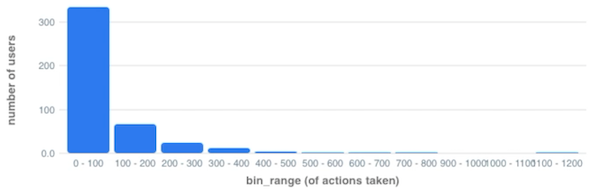
order by 1;Output:
| bin_floor | bin_range | count |
|-----------|-----------|-------|
|     0     |  0 - 100  |  334  |
|    100    | 100 - 200 |  67   |
|    200    | 200 - 300 |  24   |
|    300    | 300 - 400 |  13   |
|    ...    |    ...    |  ...  |
With a histogram, it’s far easier to see the distribution of your data:
Try it yourself?
Run this template against our sample database that mirrors real startup data. See the connection credentials, then connect in PopSQL.
Other use cases for histograms
- Bucket your customers by their number of purchases
- See the distribution of their order size
- Group your users by their level of activity
