Calculating Linear Regression in SQL
Note: this guide provides SQL queries that assume you’re familiar with statistics. Need a stats refresher? See our recommended guides below.
Companies of all sizes use linear regression to measure relationship strength between 2 variables. Examples:
- Usage of a certain feature vs. in-app spend
- Crash frequency vs. reduction of app usage
- CSAT vs. reorder rate
- etc.
Linear regression in SQL is powerful because it’s fast and iterative (just like PopSQL 😉 ).
Why Statistics?
A.I. gets all the attention, but arguably more day-to-day business decisions rely on simple statistics.
You'll likely spend more time running linear regressions than building ML models.
Hypothetical example
A lot can go wrong or right in a Support experience: wait time, number of messages back and forth, how many times an agent had to escalate a ticket, etc.
Which of these bad experiences hurts CSAT the most?
| ticket_id | csat | wait_minutes | num_messages | num_escalations | 16 other hypothetical variables |
|-----------|------|--------------|--------------|-----------------|---------------------------------|
| 3464222   | 5    | 5            | 2            | 0               | ...                             |
| 3464223   | 3    | 27           | 4            | 0               | ...                             |
| 3464224   | 4    | 13           | 1            | 0               | ...                             |
| 3464225   | 2    | 34           | 5            | 3               | ...                             |
| 3464226   | 1    | 50           | 6            | 2               | ...                             |
| 3464227   | 4    | 12           | 3            | 0               | ...                             |
| ...       | ...  | ...          | ...          | ...             | ...                             |
Resist the temptation to leave your SQL editor for Excel/Sheets just to spin up a graph and trend line:
Creating graphs for each variable burns time (a lot of time if you have a lot of variables). Plus Excel/Sheets is going to bite the dust if your data set has more than 20k rows.
SQL you can copy / paste
Calculating Correlation in your data
With SQL, you can blast through combos of variables, hunting for the strongest correlations:
-- for R2
SELECT
regr_r2(csat, wait_minutes) as r2_csat_wait_minutes,
regr_r2(csat, num_messages) as r2_csat_num_messages,
regr_r2(csat, num_escalations) as r2_csat_num_escalations
... --notice how all we're changing is the second parameter
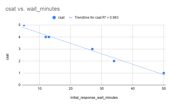
FROM support_tix;Sample Output:
| r2_csat_wait_minutes | r2_csat_num_messages | r2_csat_num_escalations | ... |
|----------------------|----------------------|-------------------------|-----|
| 0.983 | 0.824 | 0.641 | ... |R2 gives you the correlation between your variables. In this example, we can see that Wait Minutes has the strongest correlation with CSAT.
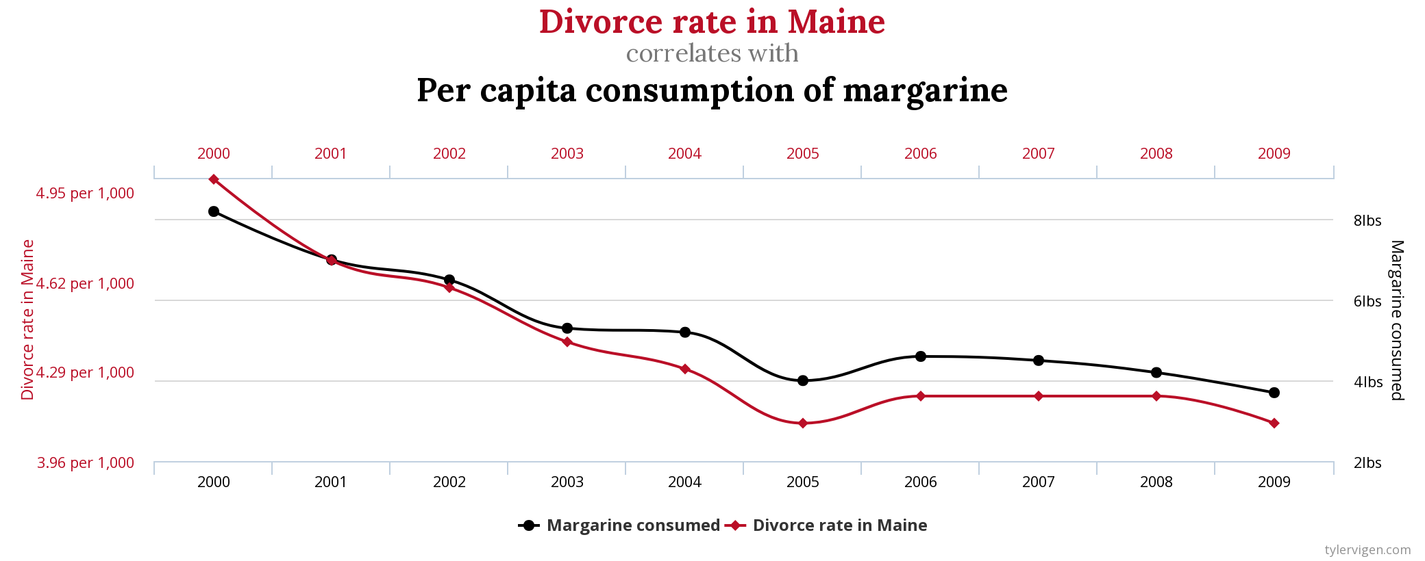
Obligatory call-out: correlation ≠ causation, as this chart makes perfectly clear:
Seeing the trend in your data
Once you establish correlation, you’ll want to see if the trend is positive or negative. To put it simply: is the trend line going up or down, if we were to graph it?
SQL again:
-- for slope
SELECT
   regr_slope(csat, wait_minutes) as slope_csat_wait_minutes,
   regr_slope(csat, num_messages) as slope_csat_num_messages,
   regr_slope(csat, num_escalations) as slope_csat_num_escalations
   ... -- note: just the function name changed from query above
FROM support_tix;
Sample Output:
| slope_csat_wait_minutes | slope_csat_num_messages | v_csat_num_escalations | ... |
|-------------------------|-------------------------|------------------------|-----|
| -0.087                  | -0.714                  | -0.887                 | ... |
Slope gives you direction and steepness of the your trend line.
Remember your algebra: slope is “rise over run”, e.g. slope = 1 means that as Y increases by 1, X increases by 1 (two minute refresher if needed).
There's a negative trend between CSAT and all variables shown above.
While you'll want to further prove this hypothesis (additional templates coming soon!), our limited data set suggests that for every minute of wait time, CSAT decreases by 0.087.
Try it yourself?
Run this template against our sample database that mirrors real startup data. See the connection credentials, then connect in PopSQL.
Bonus Content
- Need to freshen up on Statistics?
- Short and Sweet YouTube video (30 min)
- The Old Fashioned Way (an enjoyable to read textbook)
- Top-Selling, Top-Rated Udemy course (paid)
- Check out all of PostgreSQL's statistical functions
